Chasing Flights 2.0
- nuraishasb
- Oct 28, 2024
- 6 min read
Updated: Oct 31, 2024
I recently revisited my very first programming project, taking the opportunity to refine some of the code and explore new techniques.
The portions that are highlighted below are the steps I have executed in my code. You can find a detailed breakdown of both my initial and refined Python code on my GitHub profile for your review. Additionally, I've included my analysis conducted with R language, which addresses the same five questions using alternative approaches.
The 2009 ASA Statistical Computing and Graphics Data Expo consists of flight arrival and departure details for all commercial flights on major carriers within the USA. This analysis is organised around five key questions, each designed to help us explore the data more effectively. Throughout this report, a delayed flight is defined as a flight that departs or arrives more than 15 minutes later than its scheduled time.
This is a large dataset; I have strategically chosen data from 1995-1996, 2000-2002, and 2006-2007 to ensure a reliable and accurate analysis as I compare the data over time.
We begin with data loading and exploration.
The dataset contains a total of 7,453,214 entries across 29 columns. Data from earlier years is often incomplete, with numerous columns lacking values. To streamline analysis and reduce potential noise, I have removed these columns as they provide limited information and could affect model performance.
For essential features with missing values—such as flight time and delay duration—I've chosen to eliminate these rows entirely. Imputing values like median or mean could distort time-sensitive information, leading to inaccuracies in the analysis. Given the dataset's substantial size, I believe that removing incomplete entries will not significantly impact the data volume or result reliability.
1. Finding the optimal schedule
We define optimal as the period in which the number of early and on-time flights is at its peak. To achieve this I first filter the dataset to include only flights with arrival and ( & ) departure delays of 15 minutes or less. From this filtered data, I selects three columns—'Month', 'DayOfWeek', and 'CRSDepTime'—to create a subset that makes the flight schedule. I then calculate the frequency of each unique combination of these columns, then identify the top three most frequent combinations by sorting the data by frequency.

The ideal time to fly, with the lowest risk of delays, is on a Wednesday at 7 AM in May. We can also observe a trend that morning flights on early weekdays in May tend to experience less flight delays. By identifying low-delay schedules, airlines can optimise operations and boost reliability-focused marketing, while travelers gain greater confidence and flexibility in their travel planning.
(2) Efficiency of Older Planes
In this part of the analysis, we explore whether the age of planes contributes to flight delays. To investigate this, I decided to compare the average delay across different years.
I start by filtering the dataset to include only flights with arrival or ( | ) departure delays over 15 minutes, then calculate each flight's total delay by summing the arrival and departure delays. Next, I group the data by year to determine the average delay per year and create a line plot to visualise the trend over time.

On average, commercial aircrafts get replaced every 22.8 years, according to Statistica. The upward trend in delay duration from 1995 to 2000 could suggest that as the fleet of planes aged, delays increased. The sharp drop could be tied to modernisation efforts, i.e. replacing older aircraft with newer, more reliable, and efficient models. However, the September 11 attacks led to a significant reduction in flights due to decreased demand, which may have temporarily improved delay statistics. Furthermore, the early 2000s saw an economic downturn following the dot-com bubble burst, which could have further reduced travel demand and, consequently, delays. The rise in delays after 2000 could indicate rebounding demand for air travel. While the graph alone does not definitively prove that older planes are the primary cause of delays, the observed trends align with the hypothesis that fleet age could influence delay duration.
(3) Flight Destinations
We now explore how the number of people flying between different locations varies over time. We do so by comparing the flight paths across different years.
I begin by filtering the dataset to exclude canceled and diverted flights, then calculate the frequency of flight paths between origins and destinations for each year. Next, I create a new dataframe to count the total number of observations per year and merge it with the frequency data to compute the proportion of flights for each path. After identifying the top 30 flight paths based on their counts, I create a pivot table to display the proportion of flights over the years for these paths. Finally, I visualise this information using a heatmap, where the x-axis represents the years, the y-axis shows the top flight paths, and the colour intensity indicates the proportion of flights for each path over time.

A common trend observed is a general decrease in the frequency of all flight paths over the years. If new airports opened or were expanded near major hubs, such as secondary airports in larger cities like Dallas-Fort Worth or Los Angeles, it might have redistributed some traffic. The addition of regional airports could shift travel patterns by providing more direct, shorter routes that bypass larger hubs. This might explain why certain popular paths, like ORD-ATL and ATL-DFW, show fluctuations—some passengers who previously connected through these hubs might now fly directly between regional airports. Additionally, changes in travel trends, like the rise of road trips, may have drawn some travelers away from air travel. For popular short-haul routes, such as LAS-LAX or SFO-LAX, more people may choose to drive, reducing demand for flights.
(4) Cascading Failures
Cascading failures can occur when delays in one airport create delays in other airports, resulting in a domino effect that can cause widespread disruption of air travel.
To analyse this segment of my report, I identify sequences of consecutive flights on the same day for each plane, ensuring each flight's destination matches the origin of the next. I start by filtering the 2007 flight data to include only delayed flights. Next, I create a column for the flight date, then sort the data by aircraft tail number, date, and departure time to establish the correct sequence. I use column shifts to capture data from subsequent flights for each plane, allowing me to identify consecutive flight sequences. Finally, I drop temporary columns to streamline the dataframe, leaving only the essential data for analysis.
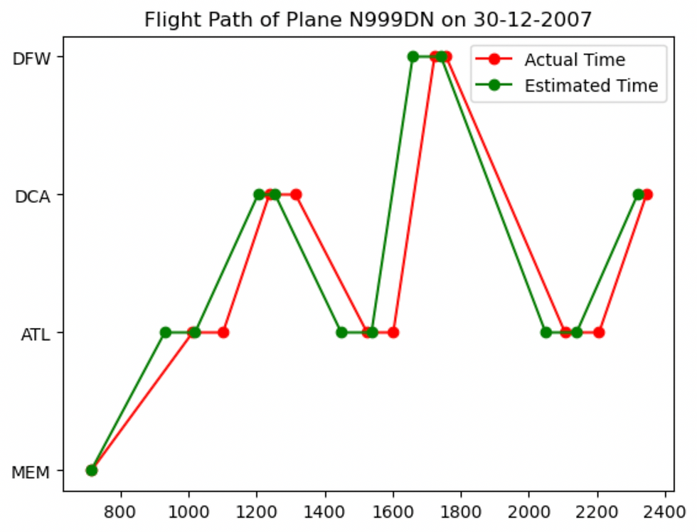
The graph above shows how an initial small delay (ATL to DCA) can escalate, leading to a significant delay in a subsequent segment (DCA to DFW). The airline's efforts to recover time in later segments also show that while cascading failures can disrupt schedules, there are opportunities to mitigate their effects through operational strategies.

This next example highlights a scenario where a single major delay between CVG and MSP cascaded, significantly affecting the flight’s schedule. Unlike the previous graph where delays were gradual and there was an attempt at recovery, this flight shows a single, sharp disruption that had a profound effect, with no opportunity for recovery within this segment.
(5) Predicting Delays
The K-Nearest Neighbours (KNN) algorithm is a straightforward machine learning method for classification. It works by finding the "k" closest points in the data to a new point and then assigns the most common category among these nearby points to the new point.
I created a binary column, 'Delay', marking flights as delayed (1) if either the arrival or departure delay exceeds 15 minutes. To avoid memory issues, I sampled 50,000 entries. The dataset was split into training and testing sets, and SelectKBest was used to identify the most relevant features. Categorical columns were encoded, and a KNN model with 5 neighbours was trained. The model then made predictions on the test set, achieving an accuracy of 84.14%.
The KNN model achieved a high accuracy, highlighting its ability to identify delayed flights based on the proximity of similar data points. I can further enhance the model's performance by exploring different values of k and experimenting with distance metrics or feature scaling to improve sensitivity to features differences.
The Support Vector Machine (SVM) with a Polynomial kernel is a machine learning method for classification. It works by finding a boundary that best separates data points into classes, using a polynomial function to handle more complex patterns. This allows it to create curved decision boundaries that fit the data better than a straight line would.
I optimised the parameters of the model using GridSearchCV. This tool sets up a grid of possible values for parameters such as the polynomial degree, intercept value, and regularisation parameter. It performs 5-fold cross-validation to identify the best combination of these parameters, aiming to maximise accuracy. The optimal model is then retrained on the training set and subsequently used to make predictions on the test set, achieving an accuracy of 97.15%.
The SVM model outperformed KNN. However, its high accuracy raises concerns about potential overfitting. To address this issue, I can apply techniques such as cross-validation and regularization to ensure that the model generalizes well to unseen data. By doing so, I can enhance the robustness of the SVM model and improve its performance on future datasets.
Comentarios